The shift to touchscreen-only cockpits is not a simple design evolution; it’s a measurable degradation of ergonomic safety.
- Data shows that interacting with a touchscreen for basic functions like climate control takes exponentially longer and requires more “eyes-off-road” time than using physical buttons.
- So-called solutions like haptic feedback and voice control introduce their own significant cognitive load, failing to replicate the safety of true tactile controls.
Recommendation: Prioritize vehicles that retain physical controls for critical, in-motion functions (climate, volume, wipers). If using a touchscreen, pre-configure shortcuts and use voice commands for non-critical tasks only when safe.
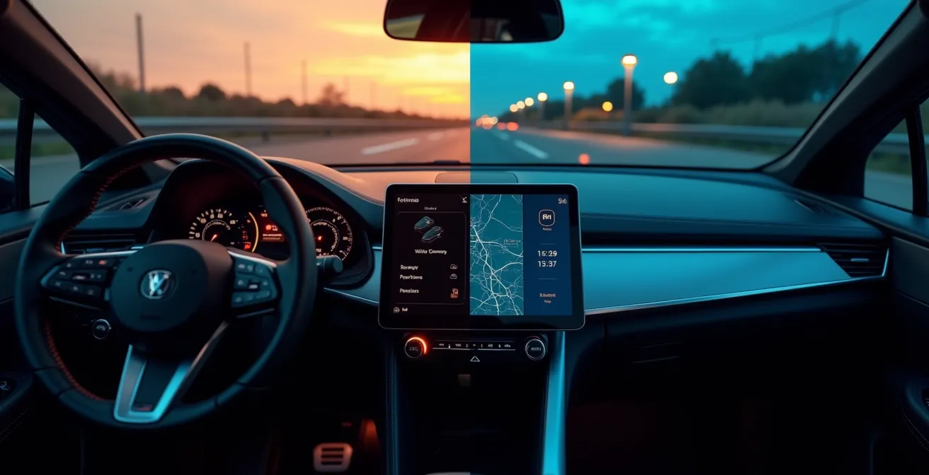
The debate over touchscreens versus physical buttons in car interiors is often framed as a simple conflict between modern aesthetics and old-fashioned usability. Automakers champion sleek, glass cockpits as the pinnacle of technological progress, while skeptical drivers lament the loss of tactile, intuitive controls. However, this surface-level discussion misses the critical, underlying issue. The widespread replacement of physical buttons is not merely an inconvenience; it represents a fundamental failure to apply the principles of cognitive ergonomics, leading to a measurable increase in cognitive load and a direct threat to driver safety.
The common argument is that drivers will simply “get used to it.” Yet, this ignores the immutable realities of human attention and motor skills under pressure. The primary task of a driver is to perceive, process, and react to a dynamic road environment. Any interface that demands significant visual attention and precise, fine-motor targeting on a flat surface actively competes for the same cognitive resources needed for safe driving. This isn’t a matter of preference; it’s a question of human-machine interface design, where decades of safety-critical research from fields like aviation are being systematically ignored in the pursuit of a minimalist, smartphone-inspired aesthetic.
This analysis moves beyond the simplistic “buttons good, screens bad” argument. We will dissect the cognitive science that explains why buried menus are so dangerous, evaluate the real-world effectiveness of supposed solutions like haptics and voice control, and explore the looming regulatory backlash. Ultimately, this guide will provide a framework for understanding not just which interface is better, but *why* one is inherently safer, empowering you to assess a vehicle’s cockpit with the critical eye of an ergonomist.
This article provides a detailed, evidence-based analysis of the key safety and usability issues. The following sections will break down each aspect of the screen-versus-button debate.
Summary: An Ergonomic Analysis of Modern Car Cockpit Safety
- Why Buried Climate Controls Increase Accident Risk?
- Haptic Buttons or Touchscreens: Which Provides Better Muscle Memory?
- How to Customize Your Home Screen for One-Tap Access to Essentials?
- How to Use Voice Assistants to Bypass Complex Touch Menus?
- The “Black Screen” Error: What to Do When Your Dashboard Reboots at 100km/h?
- The Regulatory Pushback: Is the Era of “All-Screen” Interiors Ending?
- Beyond the Car: Lessons from Aviation and Industrial Control Design
- A Driver’s Manifesto: How to Assess a Cockpit’s True Ergonomic Safety
Why Buried Climate Controls Increase Accident Risk?
Burying essential functions like climate control within multi-layered touchscreen menus is one of the most significant ergonomic regressions in modern automotive design. The danger lies not just in the distraction itself, but in a phenomenon known as cognitive tunneling. When a driver is forced to navigate a digital interface, their visual and mental focus narrows exclusively to the screen, effectively rendering them blind and deaf to the surrounding road environment. The longer the interaction, the more profound and dangerous this tunneling becomes.
The quantitative data on this is alarming. A foundational study by the Swedish car magazine Vi Bilägare measured the time required to perform simple tasks across various cars. It found that adjusting climate controls on a modern touchscreen could take up to 25 seconds for a driver to complete the task, while the same operation with physical buttons in an older vehicle took just 10 seconds. This isn’t just an inconvenience; at highway speeds, that 15-second difference equates to hundreds of meters driven with compromised attention.

As the illustration suggests, the driver’s world shrinks to the confines of the screen. Research from SINTEF in Norway makes this tangible: simply controlling music for 2 seconds while driving at 63 km/h means you have traveled over 30 meters blind. The issue is the “eyes-off-road” time combined with the cognitive load of searching, targeting, and confirming an action on a non-tactile surface. A physical button, by contrast, can be located and operated through proprioception—the body’s innate sense of position—requiring minimal to no visual confirmation.
Haptic Buttons or Touchscreens: Which Provides Better Muscle Memory?
In an attempt to bridge the gap between touchscreens and physical buttons, manufacturers have introduced haptic feedback. The idea is to use vibrations or localized pressure to simulate the “click” of a real button. However, from a cognitive ergonomics perspective, current haptic technology is a poor substitute for true tactile controls. It fundamentally fails to build robust muscle memory, which relies on proprioceptive feedback—a combination of physical location, shape, texture, and resistance that allows for “eyes-free” operation.
Haptic feedback only provides a confirmation *after* a target has been successfully touched. It does nothing to help the driver *find* the control in the first place. A physical knob or button has a permanent, predictable location and a distinct feel that can be registered by touch alone. A flat glass panel, even one that vibrates, offers no such guidance, forcing the driver to rely on their vision to locate and accurately press a virtual target. This distinction is critical and is borne out by performance data.
The difference in driver performance when using these various control types is not subtle. The following table, based on aggregated research findings, clearly demonstrates the safety and efficiency gap between interfaces. As an analysis of recent studies shows, every fraction of a second of “eyes-off-road” time increases risk.
| Control Type | Task Completion Time | Eyes-off-road Duration | Error Rate |
|---|---|---|---|
| Physical Buttons | 1.4 seconds | 0.5 seconds | 5% |
| Basic Haptic Feedback | 3.2 seconds | 2.1 seconds | 15% |
| Advanced Haptic (textured) | 2.8 seconds | 1.8 seconds | 12% |
| No Haptic Touchscreen | 4.6 seconds | 3.4 seconds | 22% |
The data is unequivocal: even with advanced haptics, task completion times and eyes-off-road duration are significantly higher than with physical buttons. The error rate also climbs, leading to repeated attempts and even greater distraction. True muscle memory is built on a rich sensory experience that haptics cannot yet replicate. The texture, travel distance, and satisfying click of a physical button provide a multi-sensory confirmation that is both faster and cognitively less demanding.

Ultimately, a system that requires visual confirmation to operate is, by definition, a system that takes the driver’s eyes off the road. Until haptic technology can create virtual topography on a flat screen, it remains a secondary feedback mechanism, not a primary guidance tool. This makes it inferior for developing the instant, reflexive control that is the hallmark of a safe and ergonomic interface.
How to Customize Your Home Screen for One-Tap Access to Essentials?
While a screen-dominant interface is ergonomically suboptimal, drivers can take steps to mitigate the inherent risks. The most effective strategy is to meticulously customize the infotainment home screen to minimize interaction time for critical functions. The goal is to reduce complex, multi-tap sequences into a single, predictable touch. This requires a disciplined approach to prioritizing what truly needs to be accessible while the vehicle is in motion.
The core principle is to create a stable, simple, and high-contrast layout that serves as a predictable foundation for your muscle memory. This means resisting the temptation to fill the screen with widgets and notifications. A safety-first dashboard is a sparse one. This issue is more than a minor annoyance; a recent survey of 92,000 US buyers ranked infotainment systems as the single most problematic category in new vehicles, highlighting widespread user frustration. Effective customization can directly address many of these pain points by placing control back in the user’s hands.
By creating a clear hierarchy of functions and ruthlessly simplifying the main screen, you can significantly reduce the cognitive load required to operate the system. The less time you spend searching for a virtual button, the more time your eyes and brain are dedicated to the primary task of driving. This is not about aesthetics; it’s about reclaiming a margin of safety that the interface design has taken away.
Action Plan: The Safety-First Dashboard Customization
- Categorize Functions: Before touching any settings, list all available functions. Group them into three categories: Driving-Critical (defrost, wipers), High-Frequency (volume, next track), and Stationary-Use Only (detailed navigation search, system settings).
- Apply the Rule of Three: Pin only the top three most-used, in-motion functions to your home screen or a permanent dock. Every other function should be relegated to a secondary menu.
- Establish Fixed Positions: Place your pinned critical controls in consistent, high-contrast corner locations. This consistency is the foundation for building location-based muscle memory, even on a flat screen.
- Maximize Target Size: Go into the display settings and use the largest possible icon or font size for your pinned driving-critical functions. This directly reduces the fine-motor precision required to hit the target, minimizing “fat finger” errors.
- Implement a Digital Lockdown: Systematically disable all non-essential notifications, widgets, and animations from the main driving screen. A static, predictable interface is a safer interface.
How to Use Voice Assistants to Bypass Complex Touch Menus?
On the surface, voice assistants seem like the perfect solution to the touchscreen problem. They promise a hands-free, eyes-free way to control in-car functions, bypassing complex menus entirely. While they can be a useful tool for non-critical, secondary tasks like changing a playlist or asking for directions, it is a dangerous fallacy to view them as an ergonomic panacea. The cognitive load of using a voice interface is often underestimated and can, in some cases, be even more distracting than a well-designed manual interface.
The problem is that a conversation with a machine is not a cognitively “free” activity. It requires the driver to formulate a command, speak it clearly, listen for the system’s response, and then mentally process whether the command was understood and executed correctly. If the system fails—a common occurrence—the driver must then engage in a cycle of correction and re-formulation, which is a highly demanding mental task. As David L. Strayer and Joel M. Cooper found in their landmark research for the AAA Foundation for Traffic Safety:
Driver interactions with in-vehicle speech-to-text systems (such as the infotainment offerings in many new vehicles) create the highest level of cognitive distraction among the tasks assessed.
– David L. Strayer, Joel M. Cooper, AAA Foundation for Traffic Safety Study
This finding is crucial: the mental effort required for voice interaction can surpass that of other tasks. Therefore, using voice assistants for safety-critical or time-sensitive functions (e.g., “turn on the front defroster now!”) is a high-risk gamble. The potential for misinterpretation and the subsequent correction loop can create a more prolonged and intense period of distraction than a quick, manual button press. For voice assistants to be a net safety positive, they must be used judiciously and with a clear understanding of their limitations.
- Keep Commands Simple and Direct: Use short, pre-learned phrases. Avoid complex, multi-part requests like “Navigate to the nearest coffee shop but avoid tolls.”
- Use for Non-Critical Tasks: Voice control is best suited for functions that are not time-sensitive, such as “Play artist…” or “Call home.”
- Know When to Give Up: If the system fails to understand a command after two attempts, abandon the voice interaction. The cognitive load of repeated corrections is too high. Pull over to complete the task manually.
- Leverage Steering Wheel Buttons: Always use the physical voice activation button on the steering wheel. Reaching for a virtual button on the screen to start a voice command defeats the entire purpose.
The “Black Screen” Error: What to Do When Your Dashboard Reboots at 100km/h?
The ultimate failure mode of a screen-centric cockpit is the “black screen” error—a sudden software crash or system reboot that leaves the driver with a complete loss of information and control. When the entire human-machine interface is routed through a single processor and display, it introduces a single point of failure that does not exist with distributed, physical controls. While a stuck radio knob is an annoyance, a blank dashboard at highway speed can be a terrifying and dangerous event.
The first and most critical action in this scenario is to avoid panic. Vehicle engineers design core driving systems—steering, braking, and acceleration—to operate on separate, hardened electronic control units (ECUs). The failure of the infotainment system, while alarming, will not cause a loss of primary vehicle control. Your turn signals, headlights, and hazard lights should also continue to function as they are typically on a different circuit. The immediate challenge is the loss of situational information, most critically the speedometer.
Your goal is to maintain a safe and predictable position in traffic while planning to pull over. Begin by matching your speed to the flow of surrounding traffic; this is your most reliable temporary speedometer. Listen to your engine’s RPMs—if you are familiar with your car, you can often estimate your speed based on the engine sound in a given gear. If you have a passenger, they can immediately open a GPS or map application on a smartphone, which almost always includes a reliable speedometer function. Do not attempt to fix the screen while driving. Focus entirely on operating the vehicle safely and finding the next available safe place to stop, such as a rest area or a wide shoulder, to assess the situation.
The Regulatory Pushback: Is the Era of “All-Screen” Interiors Ending?
For years, the proliferation of touchscreens has proceeded largely unchecked, driven by manufacturer trends rather than ergonomic best practices. However, the tide is beginning to turn. Safety organizations and regulatory bodies are now formally recognizing the inherent dangers of screen-only interfaces. The most significant development comes from the European New Car Assessment Programme (Euro NCAP), one of the world’s most influential vehicle safety bodies.
In a move that signals a major industry shift, Euro NCAP announced that starting in 2026, vehicles will need to have physical controls for five critical functions to achieve a top five-star safety rating. These functions are: indicators, hazard warning lights, windscreen wipers, horn, and any SOS features. While this list may seem basic, it represents a landmark admission by a key safety authority: some functions are simply too important to be buried in a menu.
This decision is not a nostalgic plea for a return to the past; it is a data-driven response to rising distraction levels. By making physical controls a prerequisite for the highest safety accolade, Euro NCAP is creating a powerful commercial incentive for manufacturers to reverse course. A lower safety rating can significantly impact sales, especially in the safety-conscious European market. This move effectively forces carmakers to re-evaluate their HMI (Human-Machine Interface) philosophy and reintegrate the undeniable safety benefits of tactile, unambiguous controls.
While the 2026 rules are a significant first step, ergonomists argue they don’t go far enough. Critical functions like climate control (especially window defogging) and volume are still left to the manufacturer’s discretion. Nonetheless, this is a clear signal. The pendulum is swinging back from a purely aesthetic-driven design to one that must, once again, prioritize the cognitive and physical abilities of the driver. The era of assuming “more screen is more modern” without considering the safety trade-offs may be coming to a close.
Beyond the Car: Lessons from Aviation and Industrial Control Design
To understand the flaws in current automotive HMI, one need only look to other safety-critical fields like aviation and industrial process control. In these domains, where a single operator error can have catastrophic consequences, interface design follows a radically different philosophy, one that prioritizes tactile feedback, redundancy, and “eyes-free” operation above all else.
An aircraft cockpit is a masterclass in cognitive ergonomics. Every switch, lever, and knob has a unique shape, size, and location, allowing a pilot to identify and operate it by touch alone. This is not a legacy feature; it is a deliberate design choice. The philosophy is “tactile-first”: can the operator perform a critical action correctly, under stress, in the dark, without looking? If the answer is no, the design has failed. The concept of burying a function like de-icing or engine control in a sub-menu would be considered gross negligence.
Furthermore, these systems are built on the principle of robustness and redundancy. Physical controls are typically single-function and hard-wired. The failure of one switch does not impact any other system. A touchscreen, by centralizing dozens of functions, creates a single point of failure that is antithetical to safety-critical design. If the processor or screen fails, a multitude of controls are lost simultaneously. This fragility is unacceptable in aviation and should be equally concerning in a two-ton vehicle traveling at high speed.
The automotive industry’s current trajectory ignores decades of established human factors research. The pursuit of a “clean” or “minimalist” aesthetic has taken precedence over the fundamental need for an interface that is resilient, intuitive, and complementary to the driver’s primary task. By drawing lessons from fields where safety is not a feature but the absolute foundation, we can see the current trend not as an advancement, but as a dangerous deviation from proven ergonomic principles.
Key Takeaways
- Operating essential functions via a touchscreen takes significantly more time and cognitive load than using physical buttons.
- Haptic feedback and voice control are not effective substitutes for the proprioceptive feedback provided by real, tactile controls.
- Software-centric dashboards introduce single points of failure (e.g., “black screen”) that do not exist with distributed physical controls.
- Regulatory bodies like Euro NCAP are now mandating physical buttons for certain critical functions to achieve top safety ratings, signaling an industry-wide re-evaluation.
A Driver’s Manifesto: How to Assess a Cockpit’s True Ergonomic Safety
The preceding analysis has established a clear ergonomic hierarchy: physical controls are superior for in-motion tasks, while touchscreens introduce measurable risk. Armed with this knowledge, a safety-conscious driver or buyer is no longer a passive consumer of design trends. You are now equipped to perform your own ergonomic audit of any vehicle, moving beyond the showroom “wow factor” to assess the cockpit’s true, functional safety.
This assessment should be a core part of any test drive. The goal is to simulate performing high-frequency tasks under the cognitive load of driving. Can you adjust the fan speed, turn on the defroster, and change the volume without taking your eyes off the road for more than a glance? Does the interface work *with* your innate human abilities, or does it force you to adapt to its deficiencies? A safe cockpit is one that minimizes task-switching penalty and allows the driver’s cognitive resources to remain focused on the road.
Ultimately, a vehicle’s interface should be a silent, reliable partner, not a demanding distraction. By systematically testing these core interactions, you can cut through the marketing and make an informed decision based on the principles of cognitive safety. Do not compromise. The market will only shift back toward safer design when consumers vote with their wallets, prioritizing functional ergonomics over fleeting digital aesthetics.
Therefore, before finalizing any vehicle purchase, conduct a thorough ergonomic test drive. Your long-term safety is far more valuable than the initial appeal of a minimalist glass dashboard.
Frequently Asked Questions on Screens vs. Buttons
What vehicle functions remain operational during infotainment system failure?
Core vehicle controls including steering, braking, acceleration, turn signals, and emergency lights operate on separate hardened systems and will continue functioning normally even if the touchscreen fails.
How can I estimate my speed without a working speedometer?
Match the flow of surrounding traffic, use engine RPM sounds as a reference (if you have memorized typical RPMs at common speeds), or use a passenger’s smartphone GPS app as a temporary speedometer.
Should I immediately pull over if my screen goes black while driving?
Only if you feel unsafe. Most vehicles can operate safely without the infotainment system. Find a safe location to stop when it is practical to do so, but avoid sudden maneuvers or panic stops unless there are other concurrent vehicle issues.